Simplii Offers Usability Test
Simplii Offers Usability Test
Discovering usability issues in the proposed new Simplii Financial offers pages and features.
Discovering usability issues in the proposed new Simplii Financial offers pages and features.
Date: May 2023
Methodology: Two studies; one moderated usability test over Zoom and one survey over Feedback Loop.
Research Goal: Uncover usability issues with the proposed offer page and validate design assumptions.
Process:
Project Onboarding
Moderated Study Planning
Moderated Study Results
Survey Planning
Survey Results
Design Assumptions Revisited
Next Steps

Simplii Offers Page
Simplii Offers Page
01 Project Onboarding
Working alongside Simplii's Senior UX Researcher, we conducted an intake meeting with the bank's Digital Experience and Design team to determine:
The reason the designteam requested a research study
Their goals for their project
Their expectations for the study
The business objectives the study results would support
Through this meeting, we determined that an evaluation of the usability of the proposed design was needed to ensure the new pages and features were easy to understand and navigable by banking clients.
The design team also had a mobile and desktop version of the page, both of which they wanted to test.

Offers Page tabs; "Offers" and "Partner Offers" as the labels.
Based on the study goal, we determined some core assumptions and questions to focus on answering in the study:
Does offer order make an impact on offer claim rates? How will they choose an offer?
The team assumes clients will scroll through offers.
Clients will go to the second "offers" tab.
Participants won't understand the difference between the Offers and Simplii Offers tabs.
The two headlines or short descriptions are not seen as too much text.
Participants will know how the offer activation status system works.
Based on the above study goals, design assumptions, and questions, the research team decided to conduct two studies; one moderated study and one survey.
02 Moderated Study Planning
For the moderated study, the mobile prototype would be used. To begin, I assisted the Senior UX Researcher in creating a discussion guide using Microsoft Excel.
During the test, participants were given three tasks:
You are interested in learning about the promotions the bank is offering. How would you go about finding out this information?
You need to send money to your friend in Spain and know there's a promotion for this. Show me how you can get the promotion.
You want to get a food delivery box service and know there's a promotion offer available to claim. Show me how you can get the promotion.
Participants were also asked questions on various pages, including their thoughts on what should be added, removed, or changed.
We then created a study on User Interviews and recruited 9 participants who had used mobile digital banking in the past 90 days and were between the ages of 18-50.
After the study, I analyzed the results using deductive qualitative coding. The Senior UX Researcher and I grouped the results based on the original study goals, analyzing the usability issues and rating them by severity, and listing some participant suggestions, "wins", and "pain points".
03 Moderated Study Results
Overall, participants found some issues with the prototype:
The labels for the tabs that separate the two kinds of offers was confusing.
There was little information on how to redeem the offer on the page.
There were no instructions on whether the participant had to remember the promotion code or if it will be applied automatically.
There was no expiry date on the individual pages for each offer, they were only listed on the page with the overall list of offers.
Participants didn't understand why Simplii offers weren't applied automatically by the bank.
Participants also were unsure which offers were new, already seen, or already redeemed.
After the study, the labels for the page tabs for the two different kinds of offers was changed from "Offers" and "Partner Offers" to "Simplii Offers" and "Extras".

Individual offer page header. No information on how to redeem or on the expiry date can be found on the page.
04 Survey Planning
After changes were made to the prototype based the moderated study, myself, the Senior UX Researcher, and the Design Team met to plan a survey to validate the changes.
Participants were required to have used digital banking in the last 30 days, be aged 19+, and have a working mobile phone.
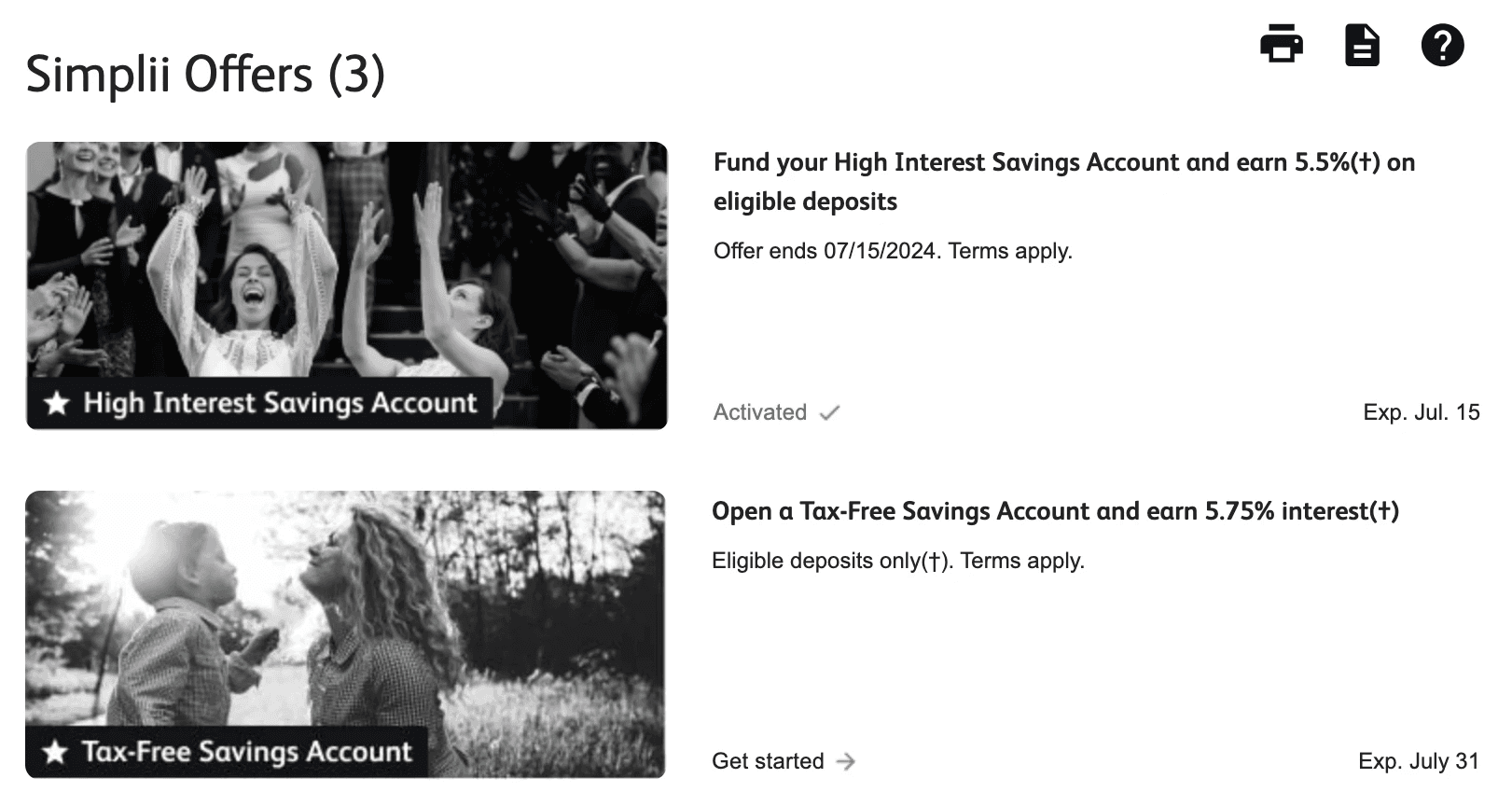
Desktop view of some offers listed. The "Activated" status was a new addition based on participant feedback from the moderated study.
The following questions were asked in the survey, pertaining to the mobile app version of the prototype. Participants were asked to play the character of a customer of the bank:
Imagine you landed on this page to lean about the promotions the bank is offering. What is your initial reaction to this screen?
What do you think is the purpose of this page?
What parts of this page were most valuable to you?
Is there anything you think are be missing or should be removed from this page?
What do you think is the difference between "[bank name] Offers" button and the "Extras" button?
What do you think about the amount of text for each offer?
Please rate the following two statements based on your current experience with the page so far:
The offers page is easy to use
The capabilities of this page meet my requirements
After the study was completed, I used qualitative coding and examined the charts generated by Feedback Loop to discover the following insights:
After the study was completed, I used qualitative coding and examined the charts generated by Feedback Loop to discover the following insights:
05 Survey Results
Based on the above questions and images of the prototype provided, participants found that overall, the page was easy to use and met their needs. They also felt that the newly added "activated" and "declined" labels made sense and could accurately describe their meanings. They also felt that there was a good amount of text on the screen.
There was however still some confusion around the two tab labels. Participants were unable to consistently describe the difference between the two tabs, and most participants all had a different perspective. Very few participants thought "Extras" meant offers from partners. This point was brought back to the design team as a high priority to be renamed.

The new—and still confusing to participants—labels in the images of the desktop prototype shared with participants.
06 Design Assumptions Revisited
After analyzing the two studies, I revisited the questions and assumptions about the prototype initially established with the design team. Along with the feedback, suggestions, and results of each study, the following answers to these questions and assumptions were shared:
Does offer order make an impact on offer claim rates? How will they choose an offer?
Participants liked having the offers in chronological order of expiry date. They also scrolled through the offers to find one that applied to their task.
Clients will go to the second "offers" tab.
Yes, participants navigated to the second "offers" tab.
Participants won't understand the difference between the Offers and Simplii Offers tabs.
After navigating to the page in the mobile study, participants understood the difference between the two tabs, but expressed that the labels used were confusing.
The two headlines or short descriptions are not seen as too much text.
Participants didn't feel there was too much text in either study.
Participants will know how the offer activation status system works.
Yes, participants understood the offer activation status labels once they were introduced in the second study.
07 Next Steps
Based on the results of the study, the largest pain point for participants was the confusion between the two tabs. Among some additional suggestions, this made up our primary suggestion to be worked on, and our research team worked with the design team and their copy writers to ensure the final labels for the tabs reflected the mental models and took into the account the specific confusing terms of the participants from both studies. The final copy for the labels were "Simplii Offers" and "Partner Offers".
After the study concluded, final changes were made by the design team and the pages were published to the Simplii app and desktop web browser banking portals.

Want to see more projects?
Simplii Superbowl Offer Usability Test
DFO Design System UX Studies
All Projects
Simplii Superbowl Offer Usability Test
Evaluating Simplii's Superbowl offer redemption page.
Date: December 2022
Role: User Experience Researcher
Methodology: Moderated usability test with qualitative coding analysis.
Research Goal: Evaluate the usability of the offer page's copy and layout to determine reasons for client dropoff.
Process:
Project Onboarding
Study Planning and Conducting
Study Analysis
Results
Next Steps
Simplii Offers Usability Test
Discovering usability issues in the proposed new Simplii Financial offers pages and features.
Date: May 2023
Methodology: Two studies; one moderated usability test over Zoom and one survey over Feedback Loop.
Research Goal: Uncover usability issues with the proposed offer page and validate design assumptions.
Process:
Project Onboarding
Moderated Study Planning
Moderated Study Results
Survey Planning
Survey Results
Design Assumptions Revisited
Next Steps
01 Project Onboarding
Working alongside Simplii's Senior UX Researcher, we conducted an intake meeting with the bank's Sales and Offers team to determine:
The reason the Sales and Offers team requested a research study
Their goals for their campaign
Their expectations for the study
The business objectives the study results would support
Through this meeting, we discovered that the team was encountering an obstacle with one of their newest campaigns; a Superbowl campaign that encouraged clients to apply for a credit card with the bank.
After the offer's release, there was lower than expected engagement from clients, and the Sales and Offers team were hoping to gain insight into potential causes. The team hypothesized that there were either usability issues with the offer layout or confusion arising from instructive wording used.
The team was hoping to be informed of specific areas that could be causing the issue in order to make edits and increase client redemption of the offer.
During the intake meeting, we also wanted to understand the Sales and Offers team's existing questions and assumptions about what may be causing the issue. The following questions guided our study planning:
What do clients expect to happen when they click "Remind me later"?
Is the large amount of consent text scary to users?
Would clients only want to see this on desktop due to less scrolling? Or is it better on mobile since it's easier to click submit on their phone?
Is the offer page too long?
Does the offer have too much text?
Can we do anything to improve overall experience rather than focusing on one specific thing?
Does the offer flow make sense? Should the sections be rearranged, like having the rates and fees higher up?
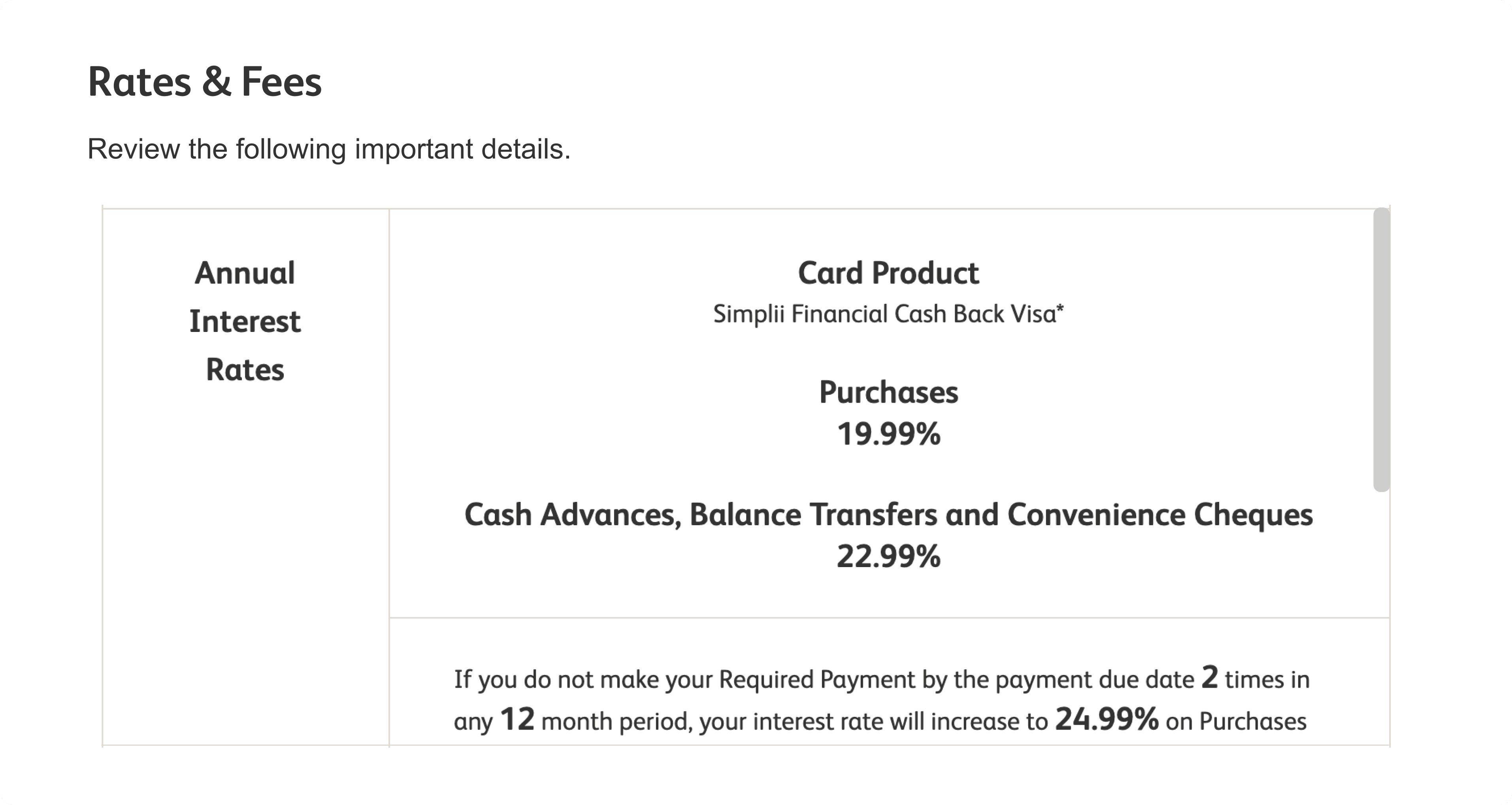
Beginning of the Rates & Fees information on the offer page. More information is accessible by scrolling inside the container.
01 Project Onboarding
Working alongside Simplii's Senior UX Researcher, we conducted an intake meeting with the bank's Digital Experience and Design team to determine:
The reason the designteam requested a research study
Their goals for their project
Their expectations for the study
The business objectives the study results would support
Through this meeting, we determined that an evaluation of the usability of the proposed design was needed to ensure the new pages and features were easy to understand and navigable by banking clients.
The design team also had a mobile and desktop version of the page, both of which they wanted to test.
Based on the study goal, we determined some core assumptions and questions to focus on answering in the study:
Does offer order make an impact on offer claim rates? How will they choose an offer?
The team assumes clients will scroll through offers.
Clients will go to the second "offers" tab.
Participants won't understand the difference between the Offers and Simplii Offers tabs.
The two headlines or short descriptions are not seen as too much text.
Participants will know how the offer activation status system works.
Based on the above study goals, design assumptions, and questions, the research team decided to conduct two studies; one moderated study and one survey.
Offers Page tabs; "Offers" and "Partner Offers" as the labels.
02 Study Planning and Conducting
02 Moderated Study Planning
With the Sales and Offers team's goals, questions, and assumptions in mind, I assisted the Senior UX Researcher in planning a moderated usability study utilizing the think-aloud protocol. We created a discussion guide using Microsoft Excel, and I built an interactive prototype of the offer page in Figma.
Our discussion guide examined the following themes:
Text and copy pain points
Usability pain points
User Expectations of outcomes of the "remind me later", "submit", and "no thanks" buttons.
User suggestions
We then created a study on User Interviews and recruited 8 participants who had gotten a credit card in Canada in the past 90 days.
I moderated 3 interviews, and was present to take notes for the remaining sessions. In addition, we invited team members from the Sales and Offers and Design teams to sit in on the interviews, providing an opportunity for them to see clients provide feedback themselves and to provide the opportunity for them to ask their own questions.
For the moderated study, the mobile prototype would be used. To begin, I assisted the Senior UX Researcher in creating a discussion guide using Microsoft Excel.
During the test, participants were given three tasks:
You are interested in learning about the promotions the bank is offering. How would you go about finding out this information?
You need to send money to your friend in Spain and know there's a promotion for this. Show me how you can get the promotion.
You want to get a food delivery box service and know there's a promotion offer available to claim. Show me how you can get the promotion.
Participants were also asked questions on various pages, including their thoughts on what should be added, removed, or changed.
We then created a study on User Interviews and recruited 9 participants who had used mobile digital banking in the past 90 days and were between the ages of 18-50.
After the study, I analyzed the results using deductive qualitative coding. The Senior UX Researcher and I grouped the results based on the original study goals, analyzing the usability issues and rating them by severity, and listing some participant suggestions, "wins", and "pain points".
03 Study Analysis
03 Moderated Study Results
After conducting the interviews, I worked on analyzing the results from the qualitative notes taken.
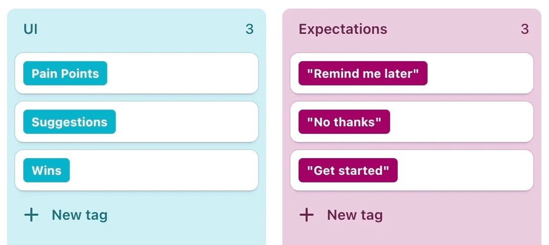
Using deductive qualitative coding, I tagged the results into themes directly based around the original questions and goals from the Sales and Offers team. The tag groups and individual tags used included:
Copy
Pain Points
Suggestions
UX
Pain Points
Suggestions
UI
Pain Points
Suggestions
Expectations
"Remind me later" button
"No thanks" button
"Submit" button
After tagging all notes taken, I created "Highlights" in Dovetail for each tag group in order to visualize and compare each participant's thoughts on each theme and summarize each actionable or relevant point.
Overall, participants found some issues with the prototype:
The labels for the tabs that separate the two kinds of offers was confusing.
There was little information on how to redeem the offer on the page.
There were no instructions on whether the participant had to remember the promotion code or if it will be applied automatically.
There was no expiry date on the individual pages for each offer, they were only listed on the page with the overall list of offers.
Participants didn't understand why Simplii offers weren't applied automatically by the bank.
Participants also were unsure which offers were new, already seen, or already redeemed.
After the study, the labels for the page tabs for the two different kinds of offers was changed from "Offers" and "Partner Offers" to "Simplii Offers" and "Extras".
Dovetail Tags—UI and Expectations Groups
Desktop view of some offers listed. The "Activated" status was a new addition based on participant feedback from the moderated study.
04 Results
04 Survey Planning
When compiling my report for the study, I broke down the information into the following sections:
Results
The most significant and actionable takeaways from the study centred primarily around the copy the offer contained rather than the usability of the page.
The most recurring theme brought up by participants surrounded the lack of information on the card itself. Clients indicated that they were interested in knowing about the annual fees, additional card holder options, card benefits and requirements, and why the card stands out.
Clients also remarked that there was an overwhelming amount of text, and that the Terms and Conditions were long.
Some language was confusing to the client audience, such as the term "pre-approval". Some participants mentioned they didn't know what that would entail, and wouldn't want to pursue an offer they didn't understand.
There was little information on the odds of winning the Superbowl prize and how the guaranteed $150 cash offer would work.
These pain points acted as blockers to adoption, as clients prioritized the long-term guaranteed outcomes of signing up over the potential chance at winning a contest.
These were indicated as suggestions from the UX Research team as an area to examine for improvement. As a result, the text on the page was edited in the updated release.
After changes were made to the prototype based the moderated study, myself, the Senior UX Researcher, and the Design Team met to plan a survey to validate the changes.
Participants were required to have used digital banking in the last 30 days, be aged 19+, and have a working mobile phone.
The following questions were asked in the survey, pertaining to the mobile app version of the prototype. Participants were asked to play the character of a customer of the bank:
Imagine you landed on this page to lean about the promotions the bank is offering. What is your initial reaction to this screen?
What do you think is the purpose of this page?
What parts of this page were most valuable to you?
Is there anything you think are be missing or should be removed from this page?
What do you think is the difference between "[bank name] Offers" button and the "Extras" button?
What do you think about the amount of text for each offer?
Please rate the following two statements based on your current experience with the page so far:
The offers page is easy to use
The capabilities of this page meet my requirements
Superbowl Offer Information—Mobile, no high-level highlights of the card itself or contest details are included.
Desktop view of some offers listed. The "Activated" status was a new addition based on participant feedback from the moderated study.

Options for client next steps: "Get started" would begin the application, "Remind me later" would trigger the popup to return next time, and "No thanks" would dismiss the offer.

Questions Revisited
I also included a section in the final report directly answering the questions established in the Project Onboarding Phase. The key findings related to these questions included:
Clients assumed they would receive an email if they selected "remind me later", which was inconsistent with the actual behaviour of the button.
Participants did not find the consent text scary.
Participants found it more convenient to view the offer on mobile, and did not find it required too much scrolling.
Participants did not find the page too long, contrary to the original hypothesis.
After the study was completed, I used qualitative coding and examined the charts generated by Feedback Loop to discover the following insights:
05 Next Steps
05 Survey Results
After summarizing the results of the study, we compiled recommendations for next steps for the Sales and Offers team to consider.
Refocus the emphasis on the offer itself rather than the contest, as clients are more motivated by guaranteed offers.
Add clear next steps clients should expect after accepting the offer in order to ease discomfort clients may experience due to lack of information.
Ensure all terms are easy to understand by an average client. For example, many participants did not know what pre-approval meant.
We then scheduled a discussion with the Sales and Offers team to share the study findings and suggestions. We discussed the pain points found, how the copy and lack of product information was likely acting as a deterrent for clients (and the reasons behind why they were acting as deterrents), and specific areas that could be edited to assist in improving adoption.
After the Sales and Offers team released their edited offer page, adoption rates made a slight increase until the end of the offer period. The offer campaign was also used as a successful case study by Braze, the platform used to build the offer page and host the campaign on Simplii's website and mobile app. To learn more about the campaign, Braze's case study can be found here.
Based on the above questions and images of the prototype provided, participants found that overall, the page was easy to use and met their needs. They also felt that the newly added "activated" and "declined" labels made sense and could accurately describe their meanings. They also felt that there was a good amount of text on the screen.
There was however still some confusion around the two tab labels. Participants were unable to consistently describe the difference between the two tabs, and most participants all had a different perspective. Very few participants thought "Extras" meant offers from partners. This point was brought back to the design team as a high priority to be renamed.
The new—and still confusing to participants—labels in the images of the desktop prototype shared with participants.
05 Survey Results
06 Design Assumptions Revisited
Based on the above questions and images of the prototype provided, participants found that overall, the page was easy to use and met their needs. They also felt that the newly added "activated" and "declined" labels made sense and could accurately describe their meanings. They also felt that there was a good amount of text on the screen.
There was however still some confusion around the two tab labels. Participants were unable to consistently describe the difference between the two tabs, and most participants all had a different perspective. Very few participants thought "Extras" meant offers from partners. This point was brought back to the design team as a high priority to be renamed.
After analyzing the two studies, I revisited the questions and assumptions about the prototype initially established with the design team. Along with the feedback, suggestions, and results of each study, the following answers to these questions and assumptions were shared:
Does offer order make an impact on offer claim rates? How will they choose an offer?
Participants liked having the offers in chronological order of expiry date. They also scrolled through the offers to find one that applied to their task.
Clients will go to the second "offers" tab.
Yes, participants navigated to the second "offers" tab.
Participants won't understand the difference between the Offers and Simplii Offers tabs.
After navigating to the page in the mobile study, participants understood the difference between the two tabs, but expressed that the labels used were confusing.
The two headlines or short descriptions are not seen as too much text.
Participants didn't feel there was too much text in either study.
Participants will know how the offer activation status system works.
Yes, participants understood the offer activation status labels once they were introduced in the second study.
The new—and still confusing to participants—labels in the images of the desktop prototype shared with participants.
06 Design Assumptions Revisited
07 Next Steps
After analyzing the two studies, I revisited the questions and assumptions about the prototype initially established with the design team. Along with the feedback, suggestions, and results of each study, the following answers to these questions and assumptions were shared:
Does offer order make an impact on offer claim rates? How will they choose an offer?
Participants liked having the offers in chronological order of expiry date. They also scrolled through the offers to find one that applied to their task.
Clients will go to the second "offers" tab.
Yes, participants navigated to the second "offers" tab.
Participants won't understand the difference between the Offers and Simplii Offers tabs.
After navigating to the page in the mobile study, participants understood the difference between the two tabs, but expressed that the labels used were confusing.
The two headlines or short descriptions are not seen as too much text.
Participants didn't feel there was too much text in either study.
Participants will know how the offer activation status system works.
Yes, participants understood the offer activation status labels once they were introduced in the second study.
Based on the results of the study, the largest pain point for participants was the confusion between the two tabs. Among some additional suggestions, this made up our primary suggestion to be worked on, and our research team worked with the design team and their copy writers to ensure the final labels for the tabs reflected the mental models and took into the account the specific confusing terms of the participants from both studies. The final copy for the labels were "Simplii Offers" and "Partner Offers".
After the study concluded, final changes were made by the design team and the pages were published to the Simplii app and desktop web browser banking portals.